


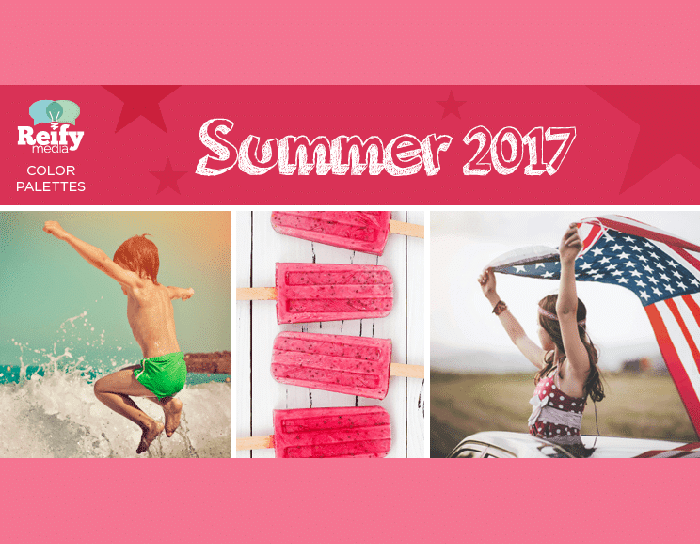
Our Summer 2017 color palettes are here, just in time for beach trips, popsicle snacks, and 4th of July festivities.
Creating a Color Palette
You might have seen in our other color palette posts—when creating a color palette, I like to pick 3-5 colors:
- 1 Main Color
- 2 or 3 Accent Colors
- 1 Background Color
Choosing a MAIN COLOR
This one gets noticed first. The main color will help bring out certain emotions or feelings when people see your marketing piece or website. Different colors attract different people or different markets. It’s a good idea to do some color research if you are trying to reach a certain demographic or sell a particular product. You can find some great color theory articles online or stay tuned for our posts on marketing with color.
Choosing ACCENT COLORS
These colors are great for highlighting parts of your design like customer testimonials, buttons, or subheadings. You can use one color as an accent or use different tones, shades, or hues of that color to get a larger variety. If you get stuck, try to use a photo to draw inspiration from. If you are choosing from a stock photo website, most of them have options to search by color, which is a great starting point.
Choosing a BACKGROUND COLOR
You need a place for the eye to rest: a nice backdrop that compliments the color palette and doesn’t compete with the messaging colors. This can be a bold dark color that helps the other colors pop. Or go with a really light smooth color that blends everything together.
Summer 2017 Color Palette Examples
Here are three examples that highlight inspiring summer colors. We hope they add spark to your Summer 2017 projects!
Palette 01 – Summer Shellebration
The salt, the sun, the sand—there’s nothing like a long beach day. And when you’ve been swimming since sunrise but still have energy to jump the waves? That’s our kind of summer fun. This color palette draws energy from the cool ocean water while also pulling from the heat in the sand, shells, and setting sun.

Great for: children’s product packaging, primary education websites, beach or pool products.
Palette 02 – Berry Sweet
There’s nothing better than an ice cold popsicle on a hot summer day – except maybe when you also get a good Dad joke from the popsicle stick. And whether you like raspberry, strawberry, or pink lemonade – this color palette has your flavor!

Great for: baby shower invitations or birthday party themes, organic farmstand packaging, advertisements that share sweet summer discounts.
Palette 03 – Star Spangeled
When you hear “Red, White, and Blue”—Do you think of fireworks? A small town parade? A baseball stadium with fans removing their caps, standing in unison for the national anthem? This color palette pulls inspiration from the American flag, paying tribute to the red, white, and blue with subtle, traditional complementary colors.

Great for: 4th of July events, American-made products, patriotic posts.
We hope you’ll use these ideas to create your summer 2017 color palettes. Or if you need more ideas, check out https://coolors.co, a cool website to play around with colors.
And of course, let us know if we can help bring some color and style to your marketing or training products. Until next time, happy coloring – and Happy Summer!