


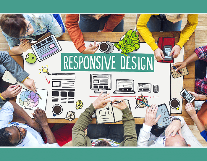
Everyone is talking about the Google Mobile Algorithm. For good reason! These changes, rolling out April 21st, could seriously affect Google search results—with mobile-friendly sites performing better in rankings. Now everyone’s buzzing about responsive web design, since it’s the best way to make sure your site is mobile friendly.

Try out Google’s Mobile Friendly tool to see if your site passes the mobile test, like ours did!
But responsive design isn’t just a way to create a mobile friendly website—that’s only one important part of what it is.
So, if you get tired of the algorithm scare talk (I mean, Google does change it hundreds of times a year, after all), here are six responsive design trends that’ll help expand the responsive design discussion beyond the Google Algorithm.
1. Responsive Design in eLearning
How can responsive design help learners interact with online training or online courses, and what design strategies do eLearning developers need to keep in mind when utilizing responsive design? This trainingZONE article shares great tips, from font choices to animation advice, and includes helpful examples of screens across device types.
2. Responsive Design for Logos
What if your website is responsive but your logo isn’t? It’s important to consider all the media in your website, not just the website itself, when you talk about responsive design. Logos are a paramount part of that discussion. We love this article from Econsultancy because it shares lots of great logo examples from some of the top brands.
3. Responsive Design for Storytelling and Reporting
A lot of people talk about responsive design as a way to take existing content and make it more mobile friendly. But how is responsive design changing the way we make content in the first place? One great example is in storytelling and reporting. Check out this great Forbes article about the concept of responsive storytelling, or this interview with WSJ digital editor John Crowley about mobile reporting. And for a cool example—check out the Europe Without Flights article on your phone or tablet.
4. Responsive Design for Wearables
Often, the conversation of responsive design is limited to the big three—phones, tablets, and computers. But what about the elephant in the room—or, more likely, on your wrist? The Apple Watch is coming, and plenty of smartwatches are out there already, with their small screens that will rely on serious responsive design considerations. Meanwhile, research centers from NC State to Stanford are expanding our ideas of wearable tech and their possibilities in sectors like health, safety, and entertainment, and our client Porticos helped develop a novel kid-friendly wearable. (Basically, who knows what kinds of screens we might see on our bodies in the future.) As this great Designmodo article points out, it may be time to “…embrace the small screen and find its limitations a glorious creative challenge.”
5. Responsive Design for Virtual Reality
This great article by GIGAOM talks about WebVR, or web-based virtual reality experiences (with plenty of cool VR goggle pictures). This Scientific American article gave us some hope for seeing cool effects in our lifetime (again, goggle pictures included).
6. Responsive Design as a Philosophy on User Experience
We saved the best for last. We love this article, which argues that responsive design is about more than how something looks; it discusses responsive design as a new philosophy for understanding user experience.
#Responsive philosophy [is] the ability to respond to any situation, anywhere, for any user, inside and out.
That’s a credo we can get behind.
—
For more on our take on responsive design, or for questions about how the Google Algorithm might affect your site, or to talk about making your media more responsive, get in touch or shoot us a Tweet.
6 Responsive Design trends we love (and not just because of the @google algorithm changes) http://t.co/cfPdCnWDfa pic.twitter.com/g7aRB8gybh
— Reify Media (@ReifyMedia) April 20, 2015


