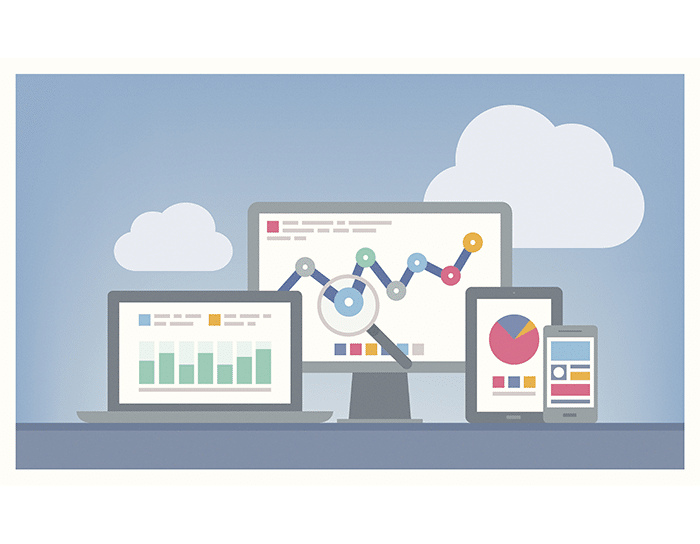
Big Data, Big Data, Big Data! You may be hearing and reading about it a lot right now. Yes, we know that analyzing large amounts of data can produce insights, drive decisions, and prompt action, but how can we engage our learners when talking about data and what it means? Thankfully it has now become much easier for people to visualize data today than ever before, and by making it more interactive and engaging, we have another opportunity to grab our learner’s attention.
At Alisa Herr’s Captivate your audience with data-driven storytelling session at WordCamp Raleigh 2016, Alisa shared several great resources:
The Data Visualisation Catalogue, a very helpful collection and explanation of charts, graphs, plots, maps, and diagrams
Google Charts which allows you to make your own visualizations.
Making it easy to visualize data allows trainers, facilitators, and educators to better engage learners so our audiences can spend more time with the content. Alisa explained that by interacting with a chart, including revealing the notes and annotations, zooming in, turning on and off layers, the learner starts to “think” about the visualized information. The EdData Dashboard that Alisa created is a great example of putting it all together.
Location is often a factor with big data. Mapping and geographic information systems can help the viewer compare areas and visualize the distribution and patterns in the data. I asked Geographic Information Systems (GIS) pro Alison Davis-Holland if she had any recommendations for those of us that want to visualize data, similar to what she has done when she created a story map about America’s Civil Courts.
Alison had three pieces of advice:
Before you create a visualization, consider
- what message you are trying to get across and to use a visualization that supports it.
- how to represent the data fairly—visualizing data Involves a lot of interpretation and subjectivity. Be conscientious about picking colors, breakpoints, etc.
- how people digest the data and the efficiency of getting your point across – you need to be quick and effective.
Two helpful resources Alison shared: For those interested in looking at featured story maps and what’s possible, check out Esri’s story map gallery. If you want to explore creating your own map, sign up for a free personal account with ArcGIS online.
These are just a few of the tools available to create your own charts and maps and there are a variety of formats that can be designed to tell a story and engage your audience. By exploring the different elements within the visual, it becomes an interactive experience for the learner. Consider the use of interactive charts and maps within your curriculum to drive learner engagement and facilitate discussion.


